


Behind the Design: The Joyful Coach Christmas Cards

Hello and welcome to a possible new mini series on here, where I walk you through the design process for a client or project I’ve worked on recently.
If you find this interesting, please let me know so I know whether or not to carry on!
I’ve been working with Sophie Cliff (AKA The Joyful Coach) for three years now, starting with redesigning her website back in November 2021 and a whole new website and rebrand this summer.
Sophie is a dream to work with and to be quite honest, as someone who isn’t always confident in her work it gives me a little boost to have clients who come back to work with me again and again.
So when she asked if I could design some Christmas cards and an animation for her to share on her social media, I jumped at the chance!
Sophie only asked for one design, but me being me I did three so she could choose which one she liked best.
Design 1: The Georgian Door
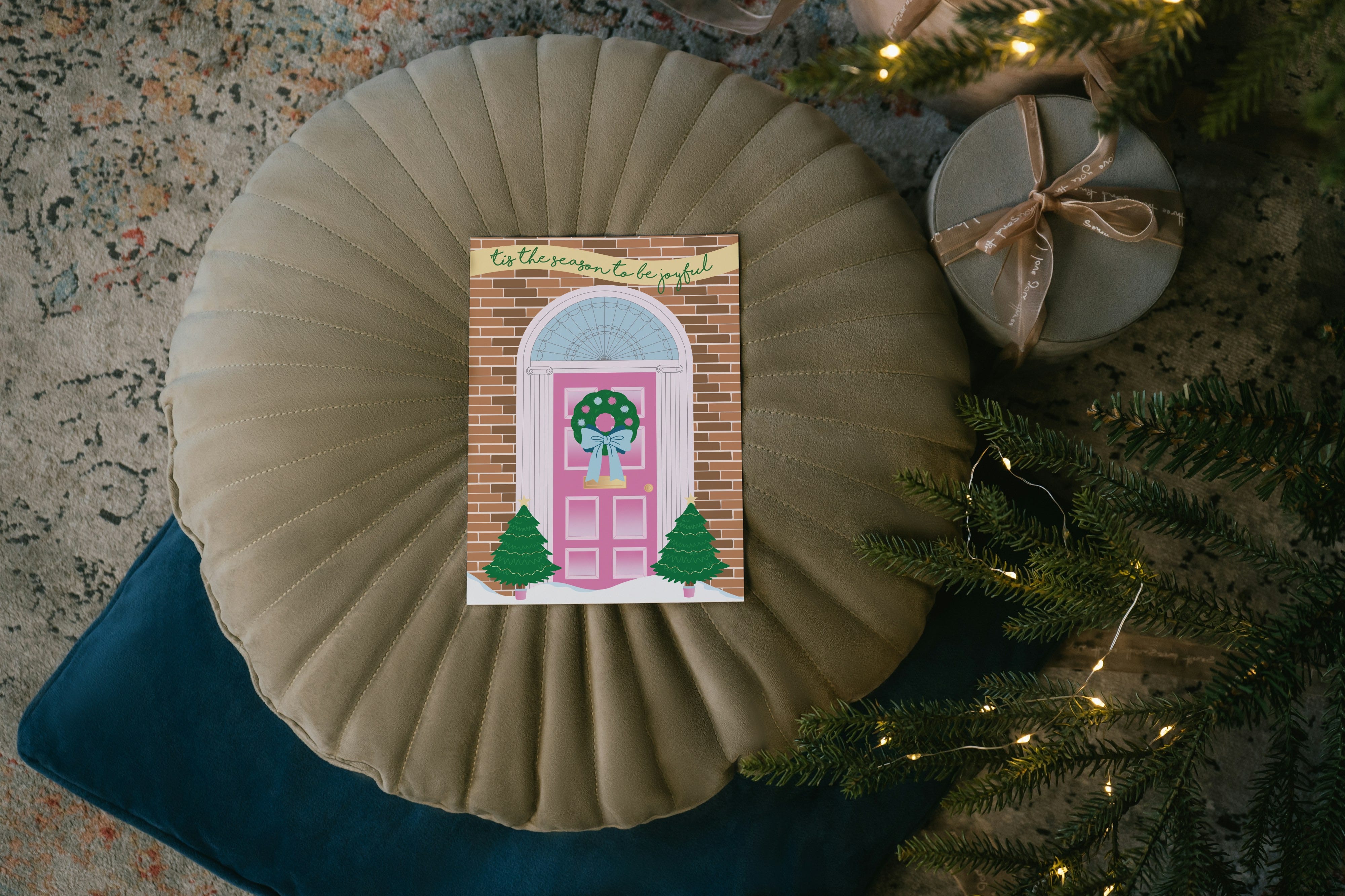
There’s a neighbourhood in Liverpool called the Georgian Quarter, which, unsurprisingly, is full of beautiful Georgian houses.
The residents get their houses beautifully dressed up for Christmas and one of my favourite festivities is walking around the neighbourhood admiring the Christmas decorations.
When I was brainstorming ideas for this project, the beautiful doors of the Georgian Quarter sprung to mind - to be honest, I’m surprised that they aren’t a common Christmas card design!
I designed the door itself and the brick background on Illustrator because I knew it would be quicker to get all the fiddly lines involved right, and the trees and wreath were drawn using Procreate on my iPad. I’ve really worked to improve my Procreate skills this year and it shows!
Design 2: The Christmas Crackers
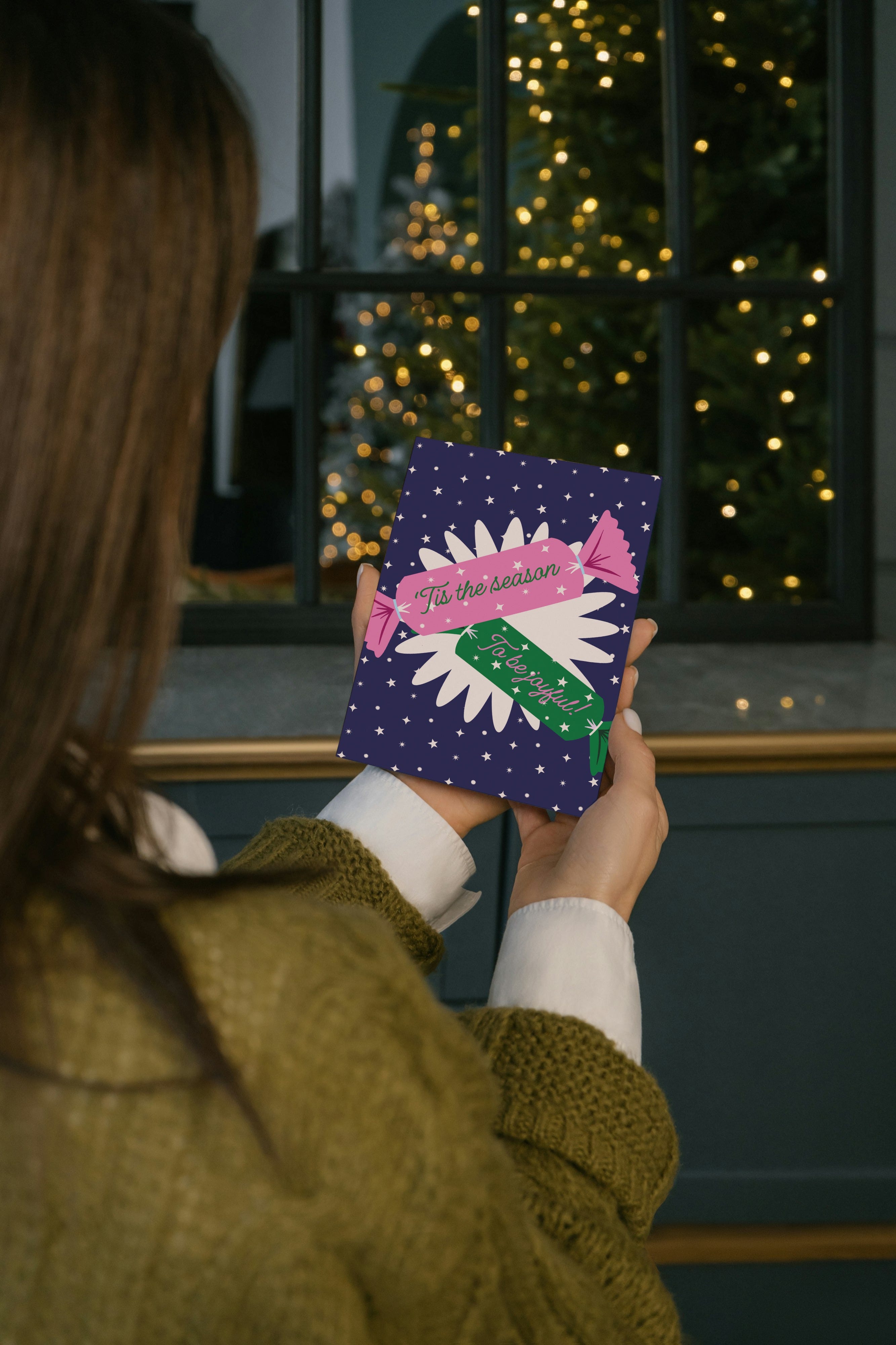
Okay, so everyone I’ve shown these cards to so far LOVES the Georgian door, but this is my favourite design, and the one that made me think “hmm, I think I might like to design more greeting cards” (I also own a stationery shop)
I drew the crackers on Procreate and used Illustrator to position them, add text and create the starry background.
The big cream starburst behind the crackers is one of the illustrations I did for Sophie’s rebrand earlier this year, so it made sense to use it in this design to keep it on brand (most of the colours used across all three card designs are Sophie’s brand colours).
Design 3: The Snowglobe
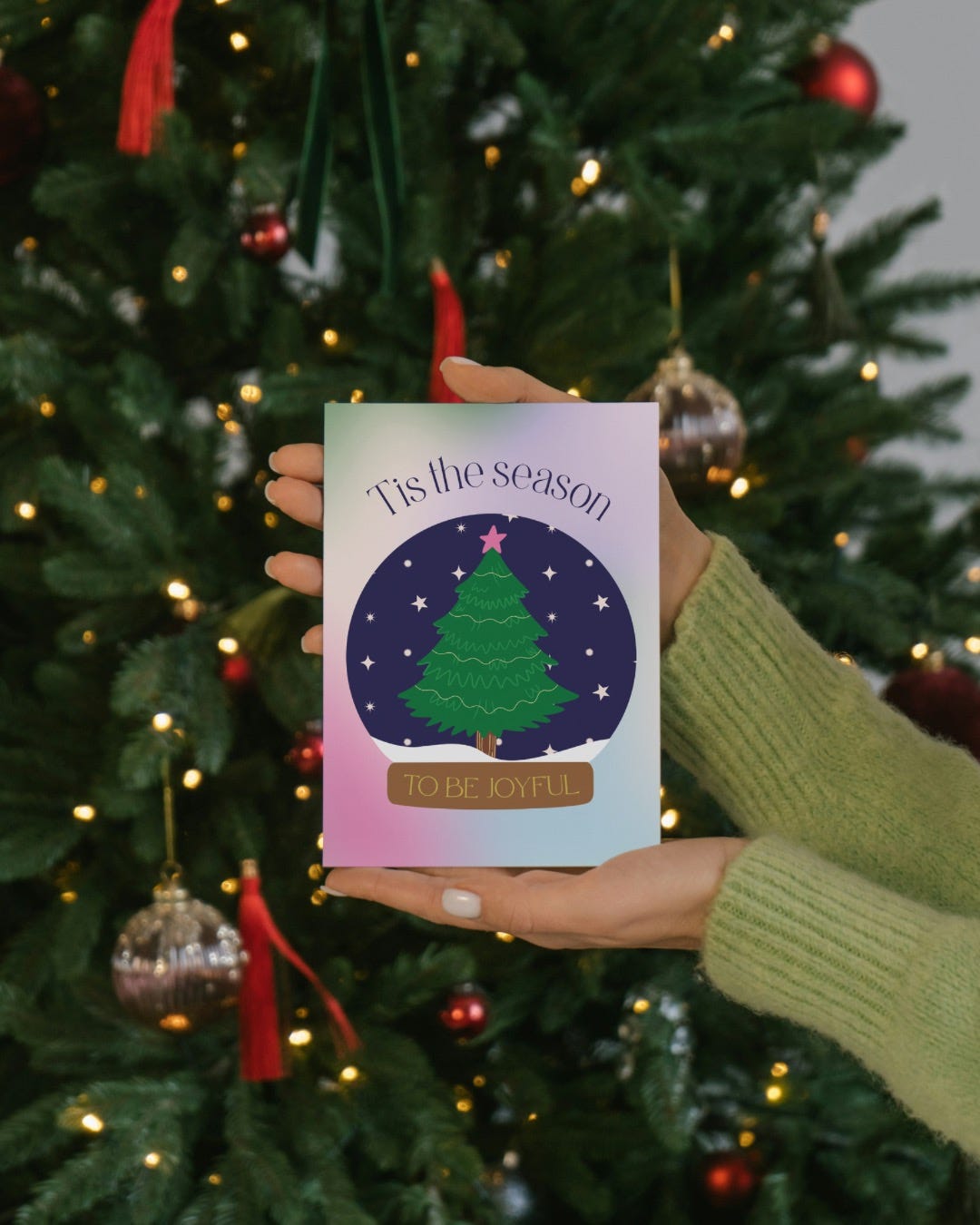
This is an idea I had from the start of this project, but I wasn’t sure if I’d be able to pull it off.
Me? Doubting my own ability then proving myself wrong? Yeah, that checks out.
The inspiration for this one was simple: I just really love snow globes. The idea of a little Christmas tree in the snow felt very cute and cosy and aligned with the nature-inspired imagery Sophie tends to share on her social media.
As you can see, I love quite a traditional Christmas setup (for the past few years we’ve had a plastic neon tree in the city centre which I think Is absolutely vile).
Sophie loved all of the designs and I’m so glad! It’s always a good project when the client has no notes.
What do you think of the cards, and would you like to see more of this kind of “behind the design” kind of post?